amtrak
App Status Revision
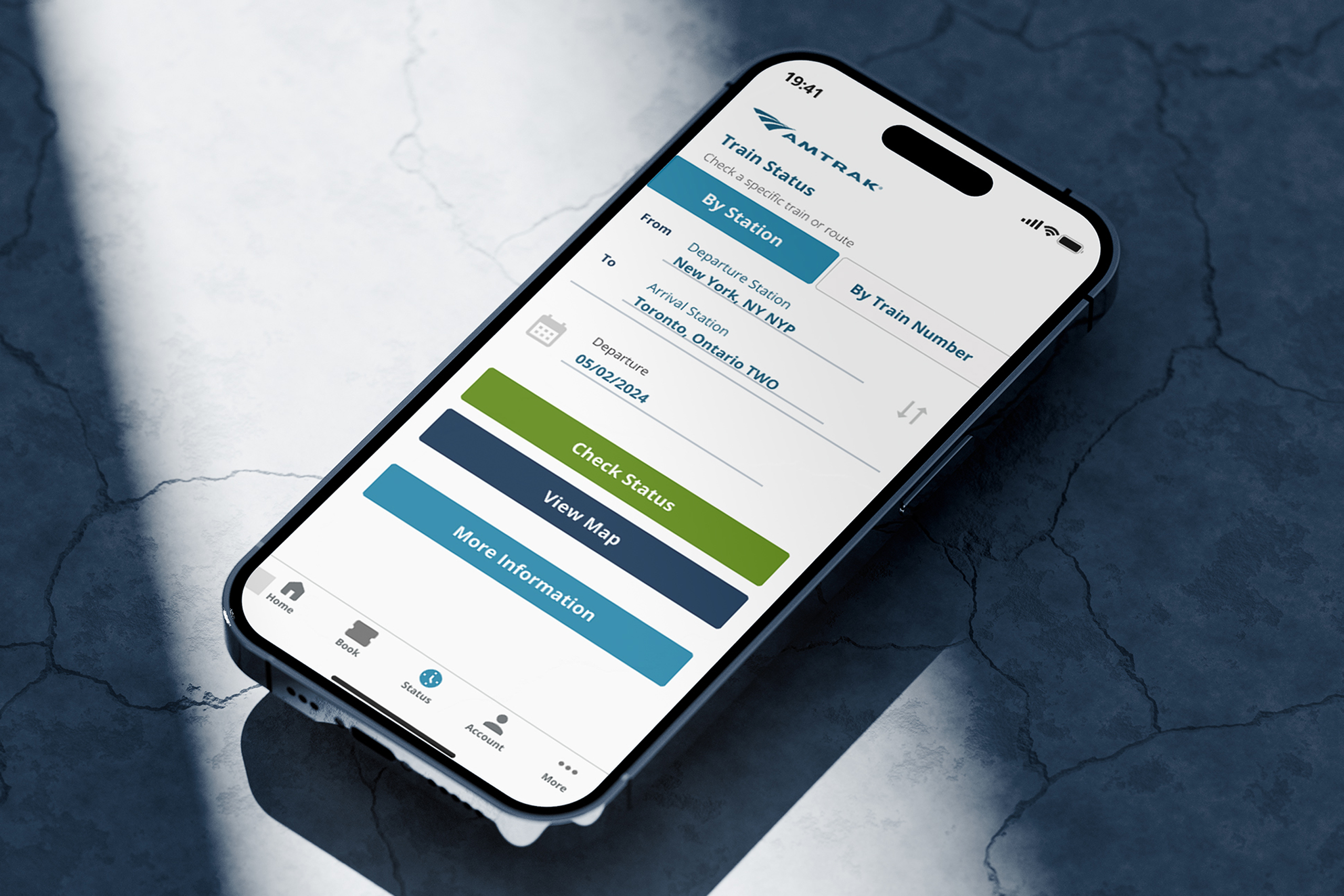
Tracking your train should be effortless and reliable. Our Amtrak app redesign enhances the travel experience by making navigation more transparent and intuitive—keeping you in control of your journey.

CLIENT
Amtrak
PRODUCT
Mobile App Redesign
Role
UI/UX Designer
Role
March - May 2024
OVERVIEW
revising A passenger APP
The Amtrak App Redesign project enhances the train travel experience by addressing critical usability issues with the Train Status page. Through extensive user research and iterative design, we introduced real-time train tracking, clear delay explanations, and improved navigation to station and route information. Our solution simplifies access to essential travel updates, reducing frustration and empowering Amtrak passengers with the information they need—when they need it.
OBJECTIVE
Improve the discoverability of train status updates and delay information.
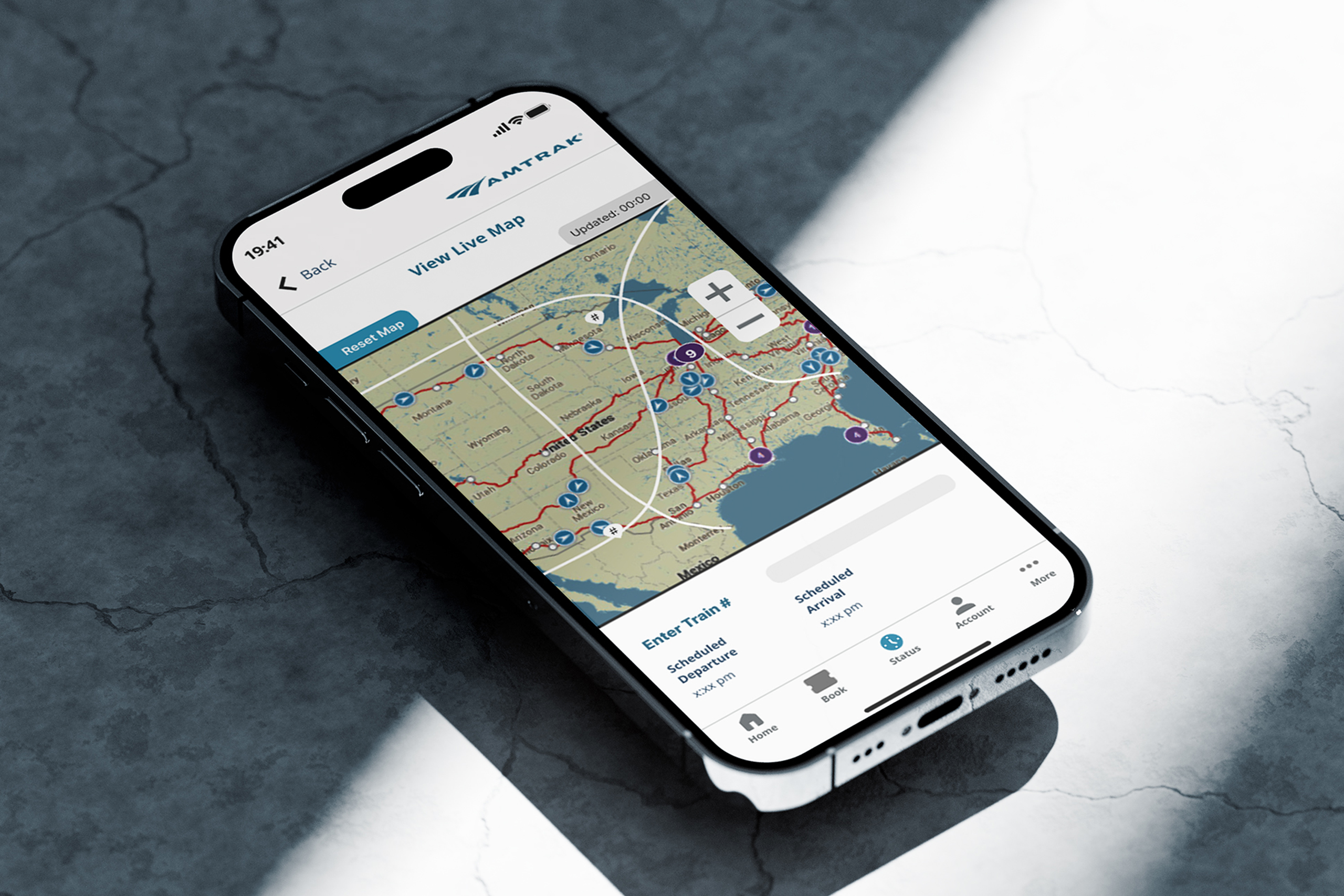
Provide a seamless way for passengers to track train locations within the app.
Streamline access to station and route details for easier trip planning.
CHALLENGES
Address user frustration with unclear train status and delay information.
Ensure the redesign aligns with Amtrak’s existing branding and navigation structure.
Conduct thorough usability testing within a constrained project timeline.
MY ROLE
UI/UX Designer and Researcher
Conducted user research to identify pain points and refine design decisions.
Collaborated with team members to develop interactive prototypes and iterate based on user feedback.
WHAT'S THE PROBLEM?
The Amtrak mobile app’s train status feature should provide users with clear, real-time updates to improve their travel experience.
The interface should offer a reliable way to track train locations, understand delays, and navigate station information. By enhancing usability and accessibility, the redesigned experience should ensure travelers can quickly find the information they need without issue.
OUR QUESTIONS?
How can we redesign the train status feature to make real-time updates more intuitive and accessible?
What visual and interactive elements will best enhance the user’s ability to track their train’s location?
What navigation improvements will reduce friction and help users find essential train and station details more efficiently?
Understand
identifying users
Personas
We spent expensive time conducting research into Amtrak’s user base to define and prioritize key user segments for the Amtrak app. By analyzing user demographics and travel patterns, we identified core personas that represent Amtrak’s diverse customer base.
These personas allowed us to learn the different ways people interact with the app and give insight into on their motivations and decision-making processes. Referencing these we worked to ensure our design choices aligned with real user needs.

Usability test findings
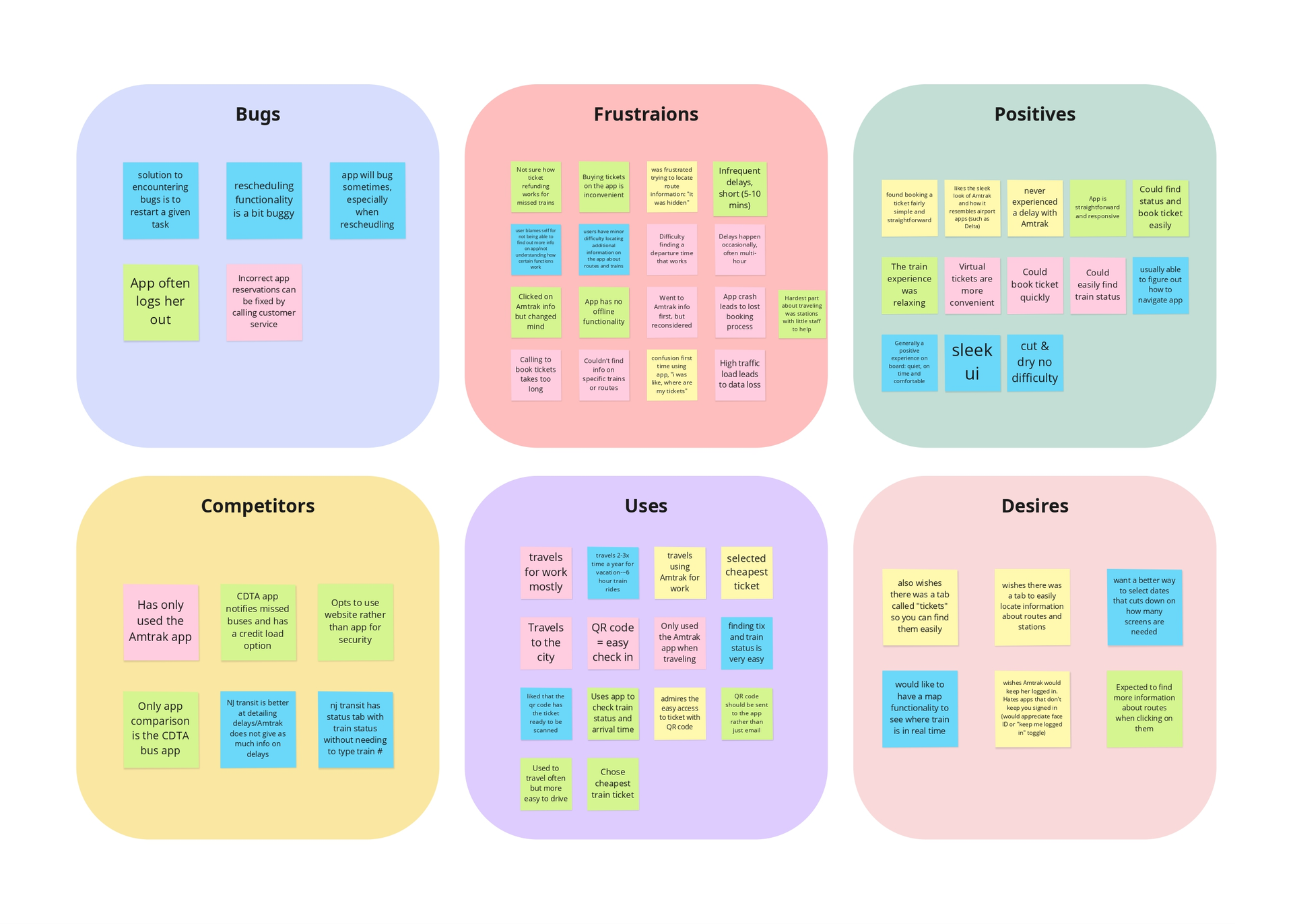
To understand user expectations and frustrations, we gathered insights on participants’ experiences with other transportation apps, including Amtrak, airline, and public transit apps. Their feedback revealed common usability challenges and desired features that shaped our redesign priorities.
Key Findings:
- Users disliked having to logging in repeatedly
- Frequent bugs, app crashes, and logouts disrupted the experience. Users struggled to find information like routes, and schedules
A real-time train map, persistent login options (Face ID), and a dedicated routes & stations section were top priorities
FEATURES & goals
We identified the essential features that define the Amtrak mobile app experience and structured with the usability feedback in mind. We aimed to create a streamlined and informative design that simplifies train status tracking and trip planning. Each feature was designed to improve real-time information delivery, enhance navigation, and provide passengers with greater confidence in their travel decisions.
Interactive Train Map
Allows users to track train locations, view estimated arrivals and progress directly in the app, reducing the need for third-party tracking.
Enhanced Booking
The ticket purchasing flow is more intuitive, with clearer trip details, easier mobile ticket scanning, and offline ticket access.
Improved Train Status
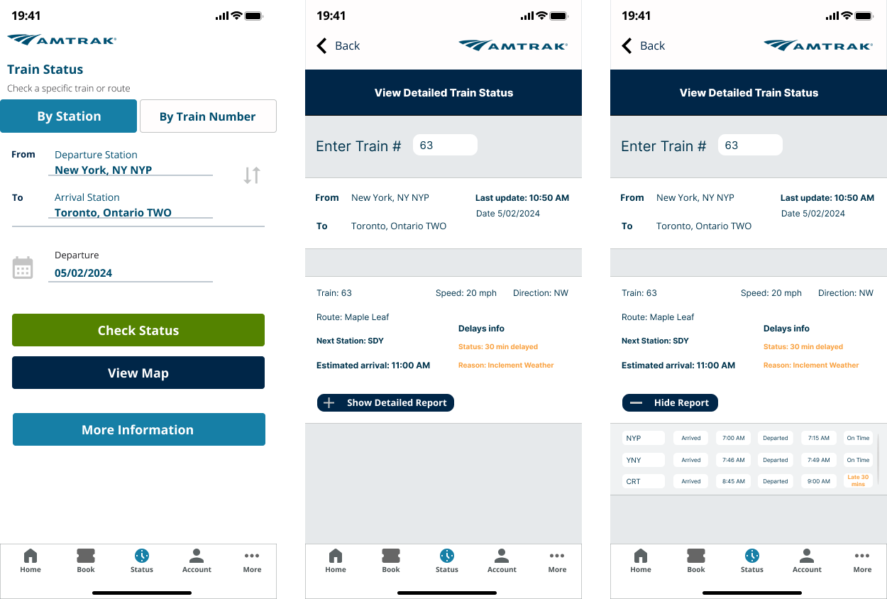
The status page consolidates arrival times, platform info, and delays in one place for quick and easy access to travel updates.
Offline Scheduling
Users can now access train schedules and trip details even without an internet connection, ensuring vital information is always available.
Delay Explanations
Real-time delay reasons are now provided in user-friendly language, helping users understand delays and adjust accordingly.
Streamlined Navigation
A redesigned layout with improved menus, larger text options, and better contrast enhances usability and accessibility for all users.
sketches
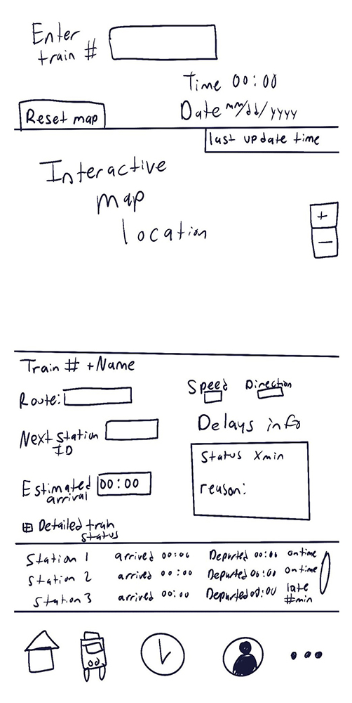
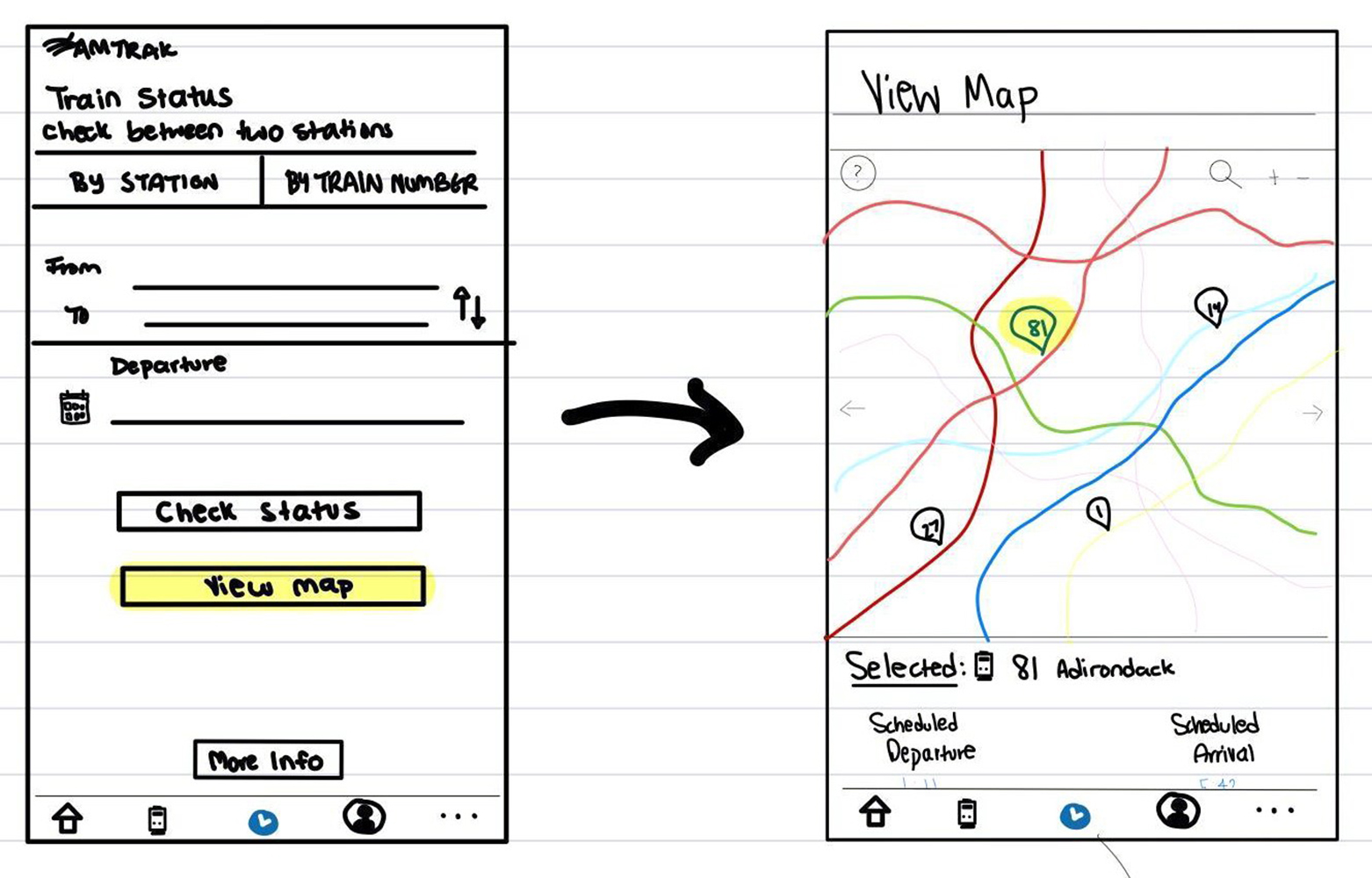
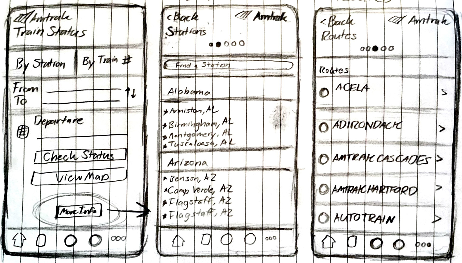
We sketched out key screens to refine the Amtrak app’s usability while introducing new features that would enhance the train status experience. Our goal was to strike a balance between detailed information and ease of use, ensuring passengers could quickly and effortlessly check their train’s status.
For the interactive map, we explored different layouts and debated whether it should be integrated into the train status page or exist as a separate screen. We also sketched concepts for a redesigned status page with clearer delay insights and an additional button for easy access to real-time tracking.

Wireframes
We then translated our sketches into low-fidelity digital layouts, allowing us to visualize how the redesigned screens would function on mobile devices. These helped us refine the information hierarchy and ensure that key details were easily accessible.
Through this process, we decided to keep the detailed train status page and interactive map separate to prevent overwhelming users with too much information on a single screen. This separation maintained clarity while still allowing users to seamlessly switch between views when checking their train’s progress.
The wireframing stage was essential in identifying usability challenges early on, helping us make informed design decisions before moving on to high-fidelity prototypes.
Interactive prototype
We developed high-fidelity designs in Figma that were fully interactive and used them to conduct another set of usability tests where participants navigated the redesigned app and completed actions like tracking trains, checking delays, and using the map. The interactive prototype allowed us to observe how users engaged with the new features and identify areas for refinement.
MATERIALIZE
DEVELOPING THE VISUAL IDENTITY
USER INTERFACE
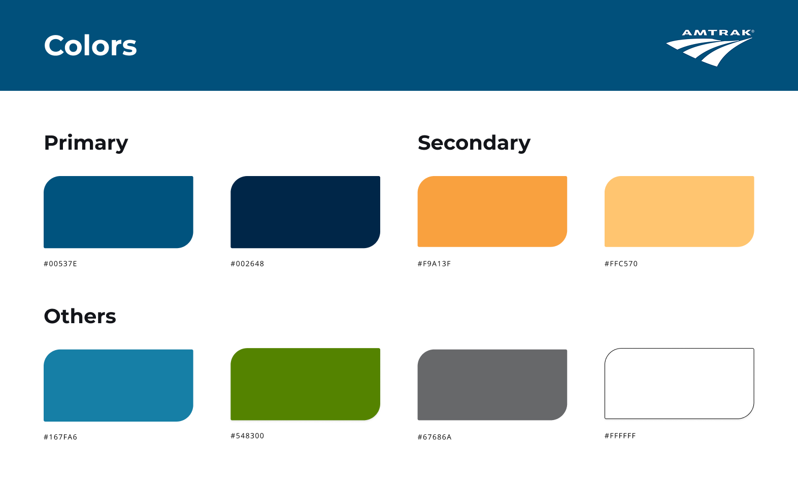
The Amtrak map UI follows a clean, modern aesthetic with a cool-toned color scheme that enhances readability and accessibility.
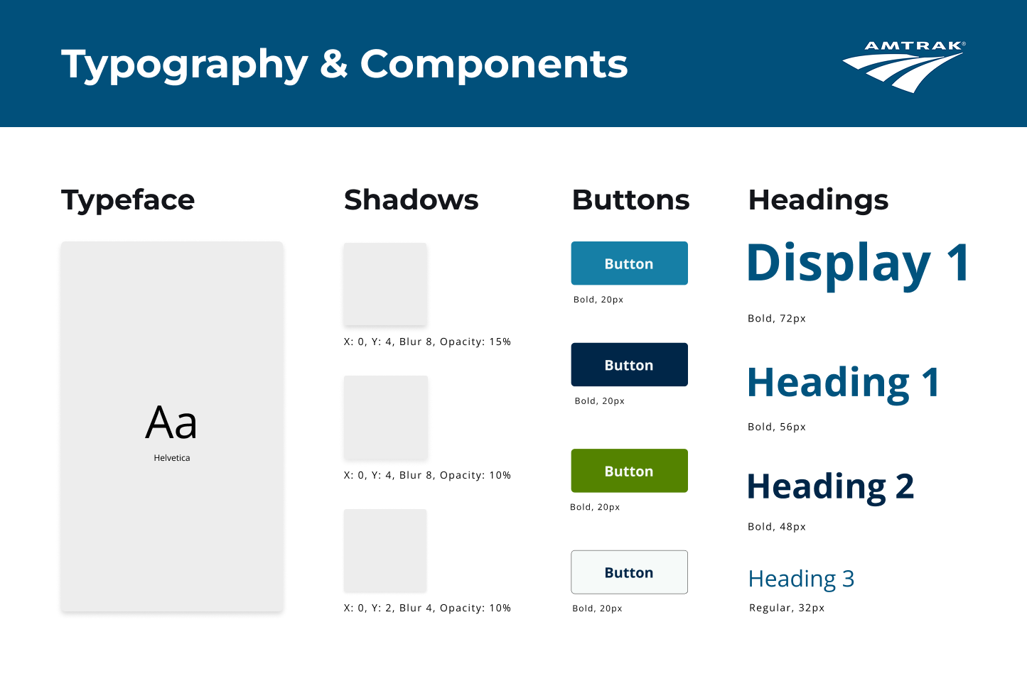
Shades of the Amtrak brand blue dominate the interface, while orange accents highlight key travel details like delays and real-time updates. Green buttons provide clear, intuitive call-to-actions for navigation and interactions. The typography chosen for this project was Helvetica, in accordance with Amtrak’s brand guidelines.
Visuals
We worked closely on the visual design of our Amtrak app redesign to align seamlessly with the official Amtrak brand guidelines.
By referencing their typography, color palette, and UI elements, we maintained a consistent and professional aesthetic that felt like a natural extension of the existing brand. To enhance the user experience, we used clean layouts, official typography, and iconography to present information in a visually digestible way.
Subtle animations and transitions were incorporated to create a smooth, modern interaction flow, reinforcing Amtrak’s reputation as a reliable and forward-thinking travel service.

DELIVER
LAUNCHING SUCCESS
RESULTS
In March 2025, we successfully completed and presented our redesigned Amtrak mobile app prototype to stakeholders at SUNY Oswego, The redesign received particular praise for the app’s improved usability, intuitive navigation, and the integration of the new features. The redesign addressed long-standing user pain points while delivering a more reliable experience for Amtrak’s passengers.
Highlights:
The live map feature allowes users to track their train’s location in real-time without external applications.
The app now provides detailed explanations for delays, including the specific station and reasoning behind it.
User testing showed a significant reduction in task completion time, with most users completing goals in under a minute.
TAKEAWAYS
Working on the Amtrak mobile app redesign project provided me with the opportunity to explore how thoughtful design can address real-world problems and improve the experience for everyday commuters. Working with a team to enhance usability and introduce innovative features gave me valuable insights into the importance of balancing user needs with business goals.
Highlights:
Operated as a UI/UX designer and researcher
Conducted user research through interviews and prototype testing
- Adapted to technical and project constraints while delivering a polished, user-centric solution
THANKS FOR READING
Tools:
Miro
Figma
Adobe CC Photoshop, Illustrator
Special thanks to:
My Amtrak project teammates
Our usability test participants
Our stakeholders at SUNY Oswego
