SUNY OSWEGO / IBM
CheckMate
Juggling tasks shouldn’t feel overwhelming. CheckMate lets you create, organize, and prioritize with ease. Conquer your tasks and get things done with a smarter way to stay on top of your to-do list.
CLIENT
IBM
PRODUCT
productivity software
Role
UI/UX Designer
Role
August - December 2024
OVERVIEW
DEVELOPING A WORKFLOW APP
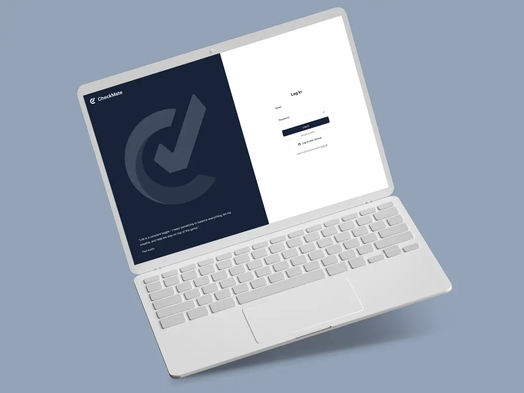
In today’s fast-paced digital landscape, task management tools often overwhelm users with cluttered interfaces and excessive features. My teams and I developed CheckMate, a minimalist web-based task management application that streamlines the experience to eliminate distractions, ensuring users can organize, and complete tasks effortlessly. CheckMate is an intuitive platform that enhances productivity without the cognitive overload—because the best task manager gets out of your way.
OBJECTIVE
- Create a design that minimizes decision fatigue by presenting only essentials
Encourage users to integrate the app into their daily routine
Gather user feedback from the release build to guide future UI improvements
CHALLENGES
Appeal to users who want to a simple way to organize tasks
Develop a usability prototype to identify improvement areas
Collaborate with multiple teams to accomplish biweekly sprint goals
MY ROLE
UI/UX Designer and Researcher
Designed wireframes, interactive prototypes, and branding materials while contributing to brainstorming sessions
Worked closely with UI designers, UX researchers, engineers, and QA specialists
WHAT'S THE PROBLEM?
The management experience in CheckMate should make creating and organizing tasks effortless for users looking to stay productive.
The task information on the homepage and project pages should be clear, consistent, and easily accessible, serving as a reliable tool for users to track their responsibilities while enhancing engagement through intuitive sorting and collaboration features.
OUR QUESTIONS?
Who is our target audience and how could we appeal to them differently than our competitors?
How should CheckMate handle task organization across multiple lists to prevent users from feeling overwhelmed?
How can we balance simplicity with functionality to avoid feature bloat while still meeting user needs?
COMPETITOR RESEARCH
- Who is the target audience for each tool?
- How does each platform handle task customization (e.g., labels, custom fields, unique task attributes)?
- How does each platform balance simplicity with functionality?
- What barriers might lead users to switch task platforms?
key takeaways
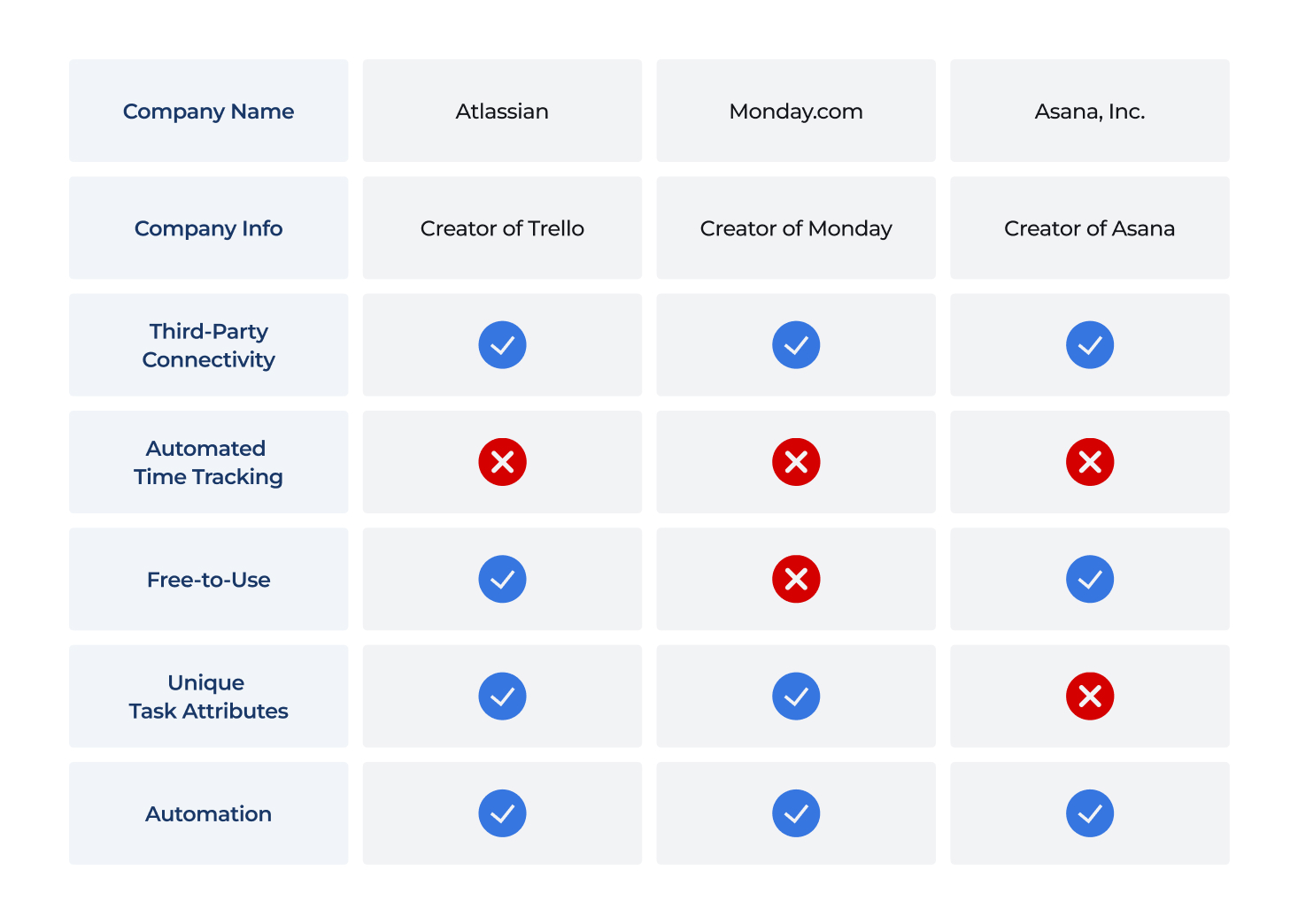
Trello, Monday, and Asana provide task management and collaboration but come with trade-offs—Trello lacks structure, Monday requires a subscription, and Asana limits customization. All offer automation and tracking but often restrict features behind paywalls.
CheckMate should focus on free collaboration, intuitive organization, and seamless onboarding to improve workflow efficiency.
Understand
identifying users
CLIENT INTERVIEWS
At the start of the project, we held multiple client interviews to define expectations, key features, and overall project goals.
Each team contributed tailored questions, covering technical aspects like device accessibility and compatibility, as well as visual elements such as branding, style, and user interface preferences. By gathering these insights, we were able to prioritize features effectively and structure our backlog to align with the project timeline.
We assessed each feature’s implementation based on time constraints, ensuring that core functionalities were integrated first.
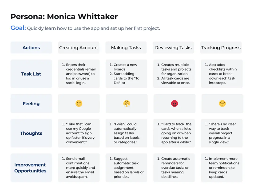
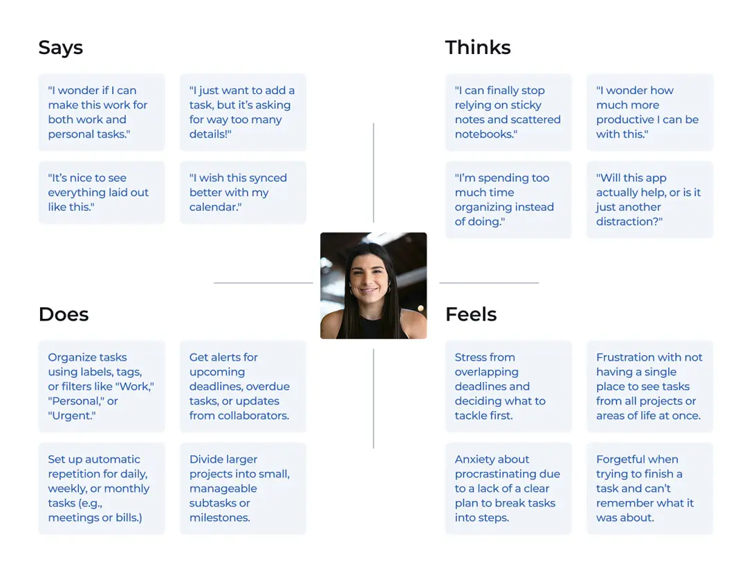
PERSONA DEV. & JOURNEY
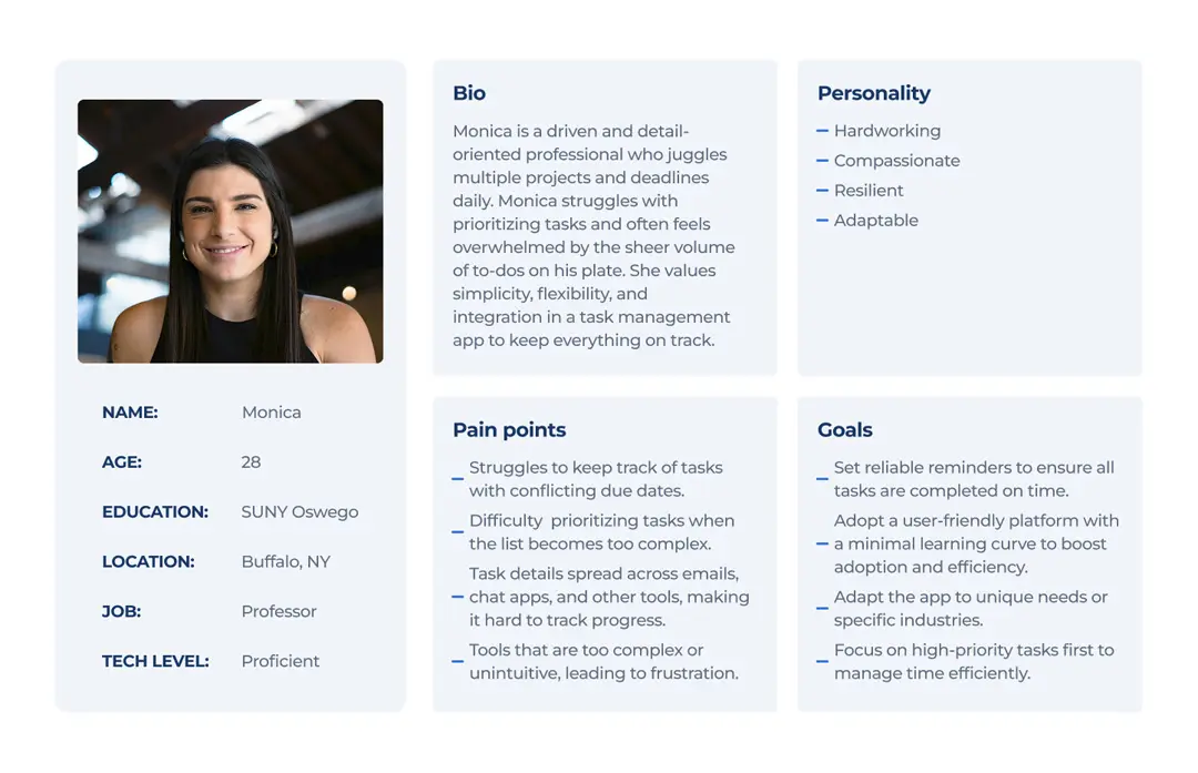
As part of the Usability team, I worked to define CheckMate’s audience. We analized their behaviors, needs, and challenges in task management to understand who they are and how they interact with similar tools.
This research highlighted key motivations and pain points, guiding us to create a seamless, intuitive experience. Mapping the user journey helped us uncover opportunities to enhance usability and workflow efficiency.
FEATURES & GOALS
We identified the core features that set CheckMate apart and focused on presenting them in a way that enhances the user experience. With our target audience in mind, our goal was to provide an intuitive, flexible system that simplifies organization. Each feature adds value by improving usability, boosting productivity, and addressing common pain points users face with existing task management tools.
Task Summary
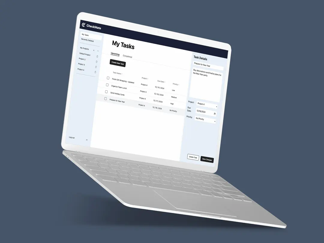
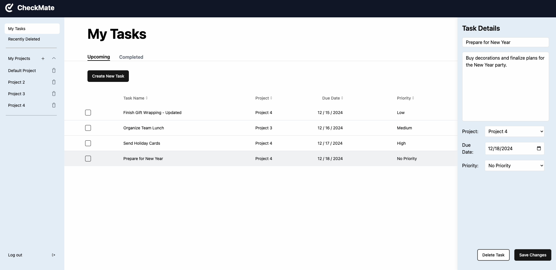
CheckMate provides a centralized view where all tasks are displayed on a single page, regardless of project.
Priority
Tasks can be assigned priority based on urgency, allowing users to focus on critical tasks and maintain their workflow.
project creation
Users can categorize tasks into separate project lists based on shared objectives, making it easier to manage workflows.
DESCRIPTIONS
Each task includes a description field, giving users space to add relevant details that might not fit into the title for better clarity.
SORTING
Multiple sorting options allow users to organize tasks by project, due date, or priority, ensuring quick management.
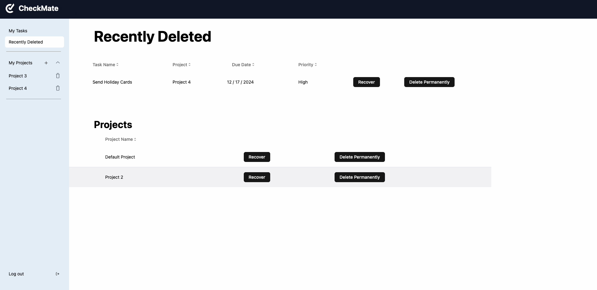
ITEM RESTORATION
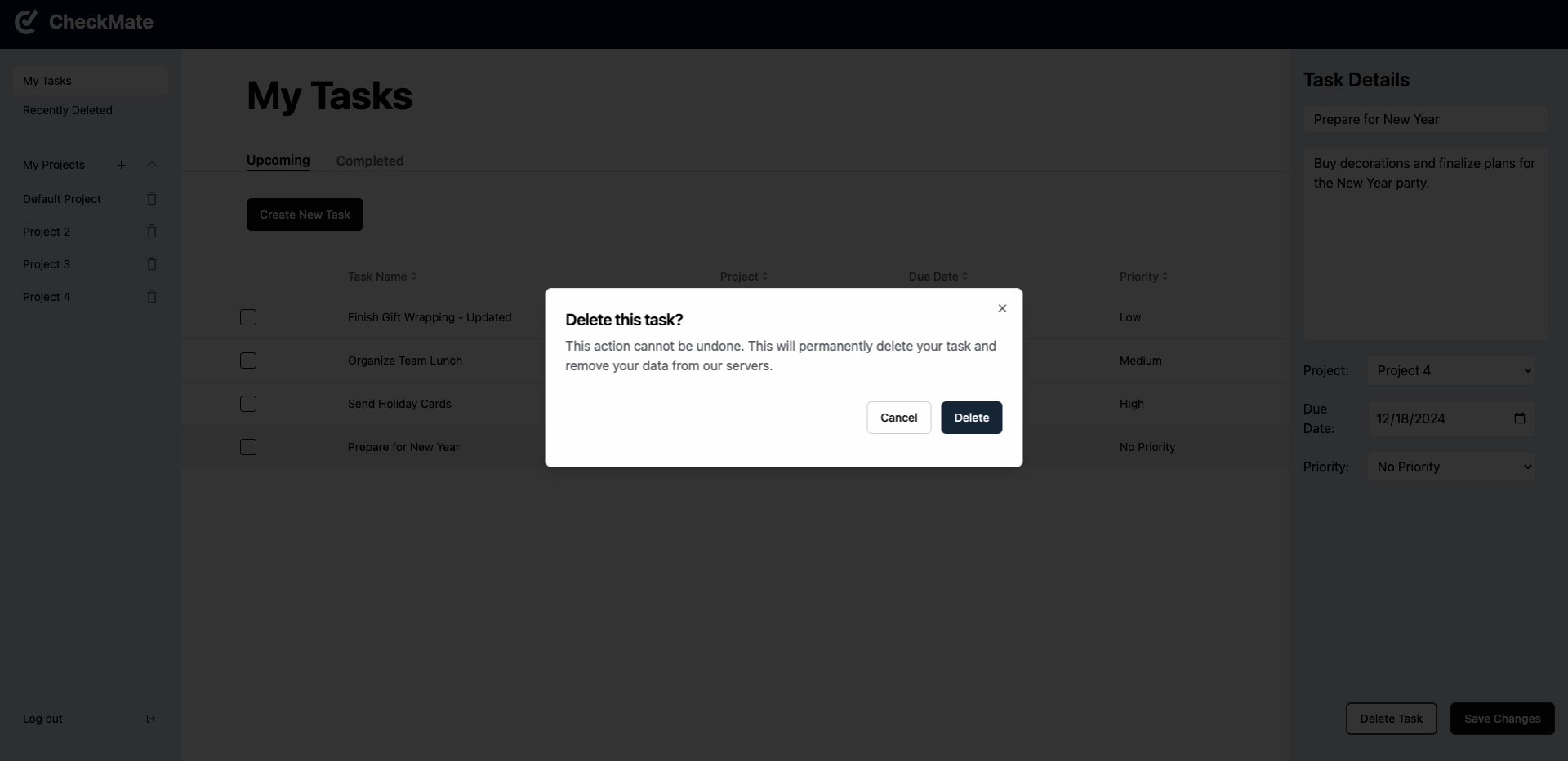
A built-in recovery feature allows users to restore or remove accidentally deleted tasks, preventing data loss.
DEVELOPMENT TIMELINE
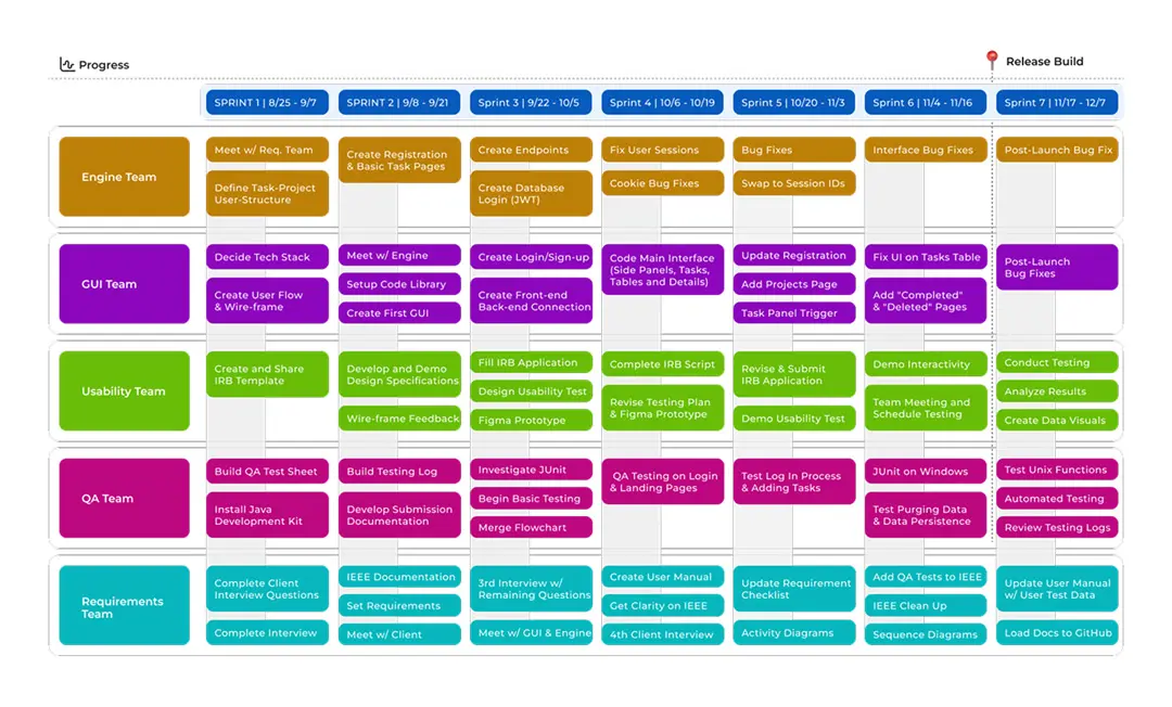
The development of CheckMate followed a 14 week Agile process, divided into seven biweekly sprints to ensure iterative improvements.
Five teams—Engine, GUI, Usability, QA, and Requirements—worked to build a functional and user-friendly application. Sprint reviews, feedback loops, and cross-team collaboration allowed us to address challenges efficiently.
As a member of both the GUI and Usability teams, I was responsible for designing the front-end interface, conducting usability research, and improving the overall user experience.
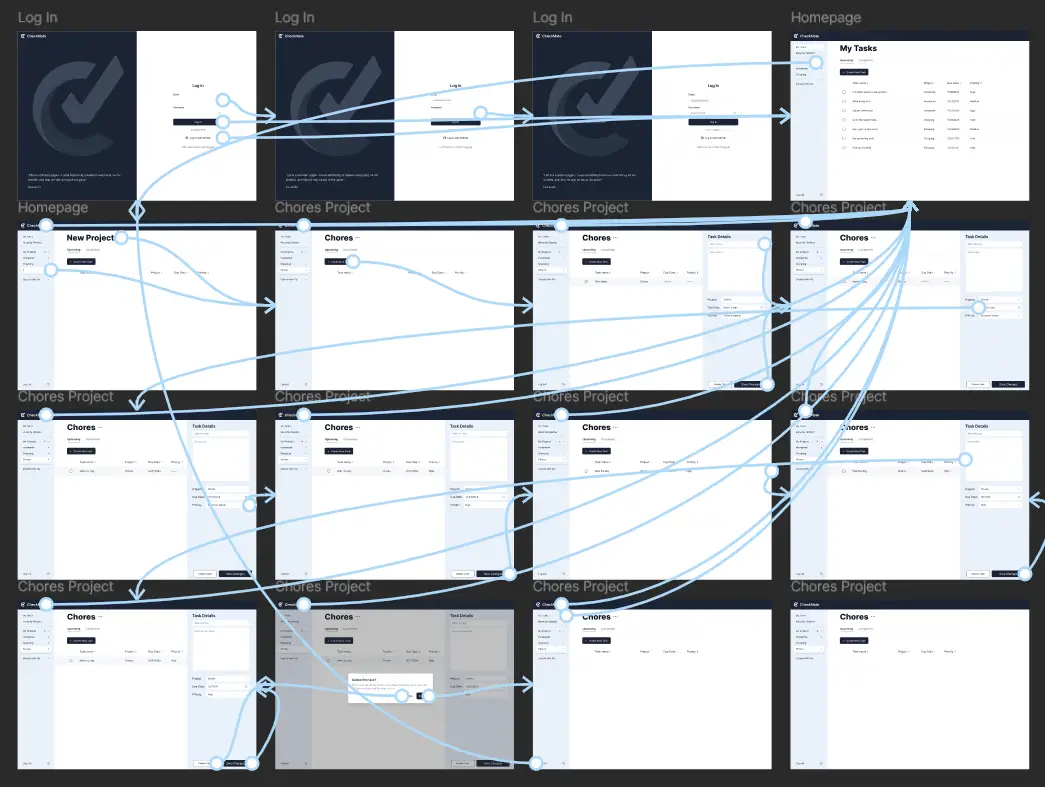
USER FLOW
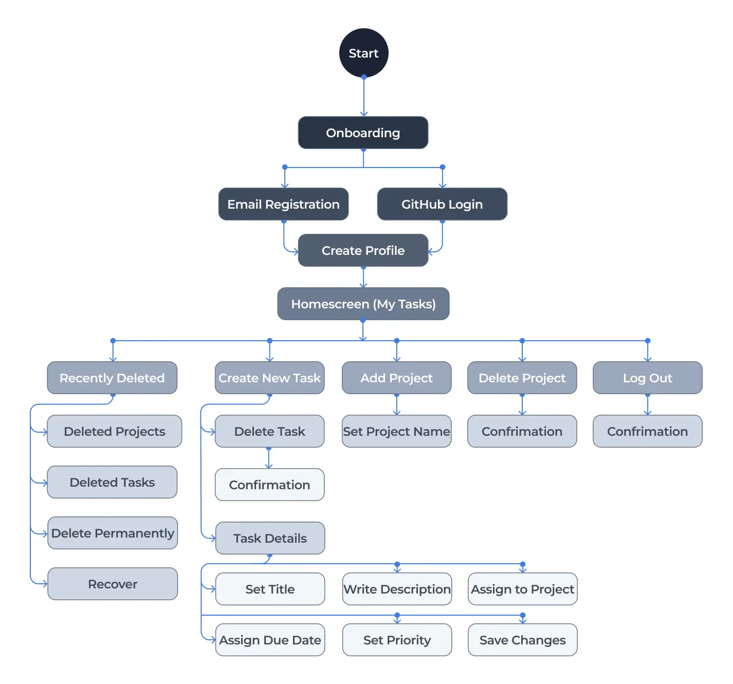
With our goals, users, and features established, we focused on designing a smooth and intuitive user flow. Our focus was on minimizing friction, ensuring users could navigate CheckMate with ease—from onboarding to organizing and tracking their tasks efficiently.
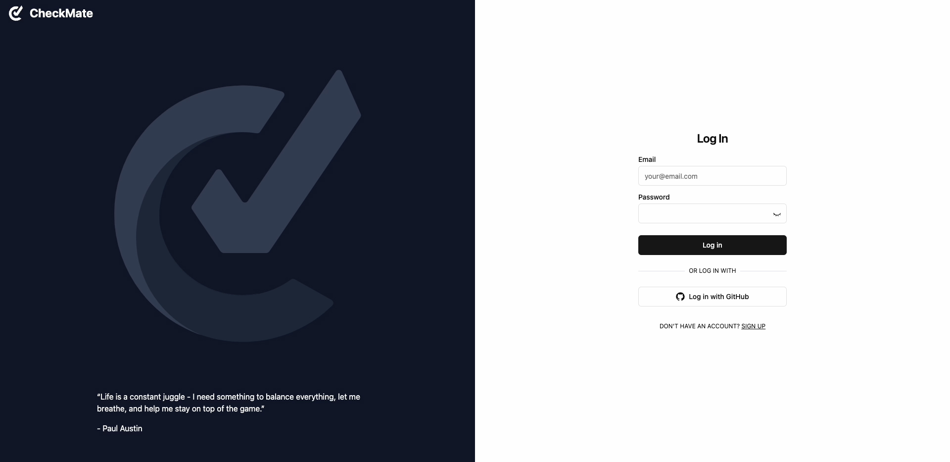
We structured a flow that emphasized clarity and accessibility, beginning with an onboarding process where users could register via email or GitHub. Once logged in, the homescreen served as a central hub, providing quick access to essential functions such as creating and organizing tasks, managing projects, viewing deleted items, and adjusting account settings.
Every interaction was carefully designed to enhance usability, and by prioritizing intuitive navigation and user-friendly interactions, we ensured that CheckMate would support productivity without unnecessary complexity, helping users stay organized and focused.
Wireframes
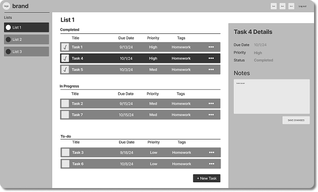
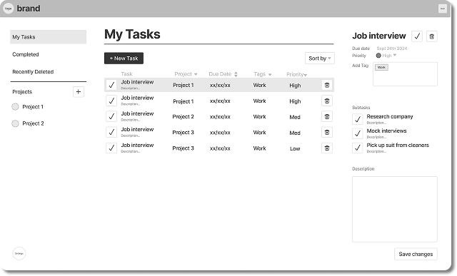
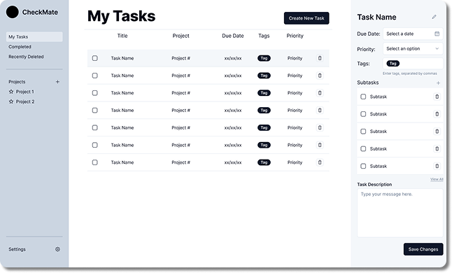
With CheckMate’s wireframe foundation in place, refining the layout and functionality became a more focused and iterative process. By analyzing industry standards from existing task management tools, we carefully structured task organization, navigation, and interaction to create a seamless experience.
interactive prototype
To refine CheckMate’s user experience, we developed an interactive Figma prototype that simulated core functionalities, including logging in, task creation, deletion and restoration. This prototype was crucial for evaluating the user flow, allowing us to identify potential usability challenges before moving into full development.
We conducted multiple usability workshops with over 10 participants, who were asked to navigate the prototype and complete key actions. Their feedback revealed areas for improvement, including better button placement, and a more defined visual hierarchy. These insights guided refinements for a more intuitive user interface.
MATERIALIZE
DEVELOPING THE VISUAL IDENTITY
USER INTERFACE
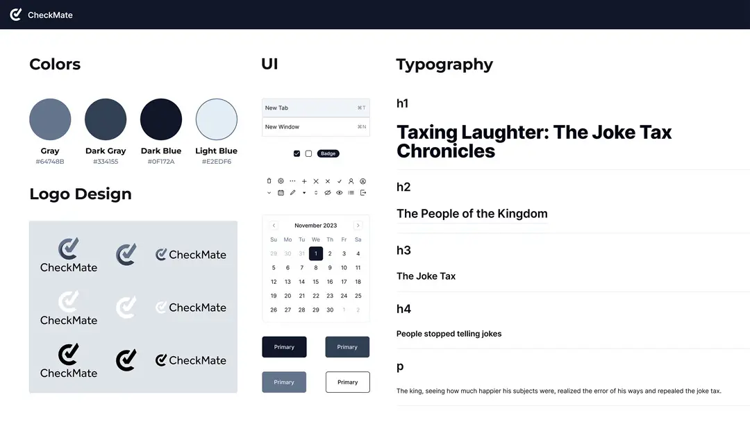
CheckMate’s visual language is built on a foundation of cool grays and blues, paired with a clean, minimalist UI to enhance clarity and focus. Our goal was to create a modern, web-friendly interface that balances aesthetics with functionality while maintaining accessibility.
To achieve this, we leveraged the shad/cn component library, which provided a robust system of pre-designed, customizable elements that streamlined development and established consistent styles for typography, color schemes, buttons, and icons.
VISUALS
The GUI and Usability teams collaborated closely to refine CheckMate’s interface, incorporating feedback to enhance clarity and usability. We increased white space and optimized contrast to ensure a seamless user experience while maintaining a visually cohesive and accessible interface. The current gray and blue color scheme establishes a modern, minimalist aesthetic, with future plans for customizable themes.
DELIVER
LAUNCHING SUCCESS
RESULTS
In December 2024, we successfully launched CheckMate worldwide, delivering a fully functional and user-friendly task management solution. Following the release, our team prepared a comprehensive presentation for IBM and SUNY Oswego stakeholders.
Highlights:
Smooth deployment with minimal issues, reinforced by quick bug fixes for optimal performance
Feedback led to planned updates, including customizable themes, integrations, and automation improvements
Stakeholders praised the platform’s design and potential.
TAKEAWAYS
It was an incredible experience working to build a real, working application and getting to work alongside talented UX designers. It was exciting to see our work come to life and benefit users.
Highlights:
Operated as a UI/UX designer and researcher
Collaborated across teams to align design with usability
Conducted user research through interviews and prototype testing
THANKS FOR READING
Tools:
Miro, Figma, VSCode
Adobe CC Photoshop, Illustrator
- Vite, React, Tailwind CSS
Special thanks to:
My CheckMate GUI and Usability teammates
CheckMate engineers, QA specialists, and Requirements analysts
Our clients at IBM and SUNY Oswego
